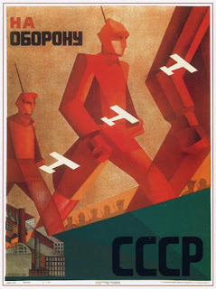
PROPAGANDA
Okay, so this week i took a walk down history lane and dived into the world of propaganda, a very important part of design history.
Looking at some of my all time favourite old propaganda posters its hard not to think of how the posters would have been interpreted in its day and for me that is the most fascinating element of all propaganda posters.
Take the famous "Uncle Sam" poster for instance, in the early 1940s, that poster was seen as positive, however as society matured and developed as a whole that poster has become a negative reflection on America and all their bloody wars.
I challenge you, have a look at a few of my favourite posters below and think about it, place yourself in the era and feel the response you possibly would have had then and acknowledge the response you have now, you have nothing to loose.
As for what i've learnt about propaganda?
Well from a design point of view, ive learnt that every era and every country had their own unique design style and way of communicating their message, some subtle, some not so subtle and well, some just...wierd.
My favourite style would be the hard, block, masculine style of the Russian Revolution propaganda posters.
 I learnt that the most important elements in a propaganda poster is simplicity, repetition, and overall understanding. The poster must make an impact! The less the colours are, the better. The catchier the phrase is, the better.


No comments:
Post a Comment